Tim Saternow’s Provincetown and New York Watercolors
by Rebecca M. Alvin
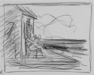
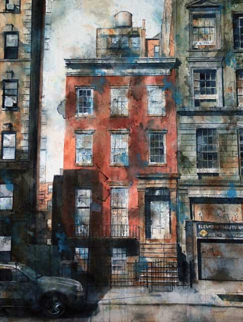
To be an artist is to take risks. There is no safety in creating images if you are working authentically because ultimately it is a translation of something highly personal to something others can appreciate and connect with. That being said, artists gain skill and experience so they can control their mediums as much as possible, always trying to master the tools and not be mastered by them. So there is something to the artist who works in a difficult medium such as watercolor, where the results are fluid and, even with the best control, can be surprising even to the creator.
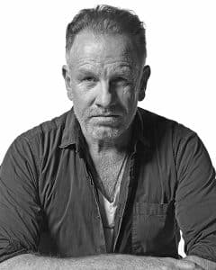
”You can tell by my style. I’m not very tight,” says Saternow. “I kind of straddle the line between very carefully done paintings and then I throw all this paint on top of it, and when you do that, the watercolor does what it wants to do. You know, it puddles, it runs, it stains something, and for me, I love that. I love the way you can’t control it. I think that gives my paintings a real interesting look.”
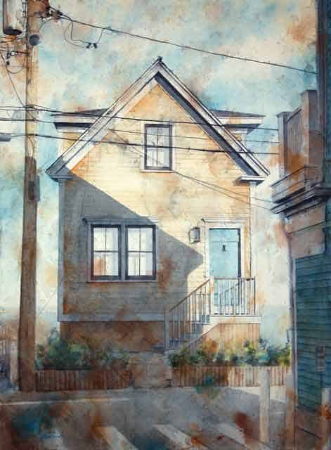
The images have an almost photographic look to them, like old snapshots ravaged by time and carelessness, as though someone may have spilled their coffee on them, and crumpled them accidentally, only to re-flatten them. Even the mounting is unique. Saternow doesn’t like the reflective qualities of glass from a traditional frame over his work, so he mounts the watercolor paper on canvases or boards and seals them with cold wax, imperceptibly, to maintain their color and longevity.
His subjects for this show, homes and buildings in New York City and Provincetown, share a grittiness that connects the two seemingly disparate worlds. The urban decay, dirt, and pollution of New York has one kind of grit, but Provincetown’s is equal, though it comes from sand and sea air and the weathering of New England winters on the ocean. They also both have that unique sunlight reflected off of the water, even though we sometimes forget that New York is actually on the water.
These are places that have histories, whether we understand them or not. Saternow follows what’s visually interesting to him, however, he does also dig a bit deeper to find out more about a place that he’s painting. In terms of Provincetown, he often uses David Dunlap’s incredibly informative online resource Building Provincetown (buildingprovincetown.com) to uncover these histories. “Provincetown has these crazy, weird combinations of buildings and why they’re there, who had built them,” Saternow says. He points to one of his paintings Kiley Court, which features a building across from that area, where Ciro & Sal’s and the Rice/Polak Gallery are located. He was initially drawn in for purely personal reasons, but then was also told of its history as an art supplies store. “I don’t know, [these buildings] speak to me. There’s something so beautiful about the proportions of those old houses in Provincetown.”
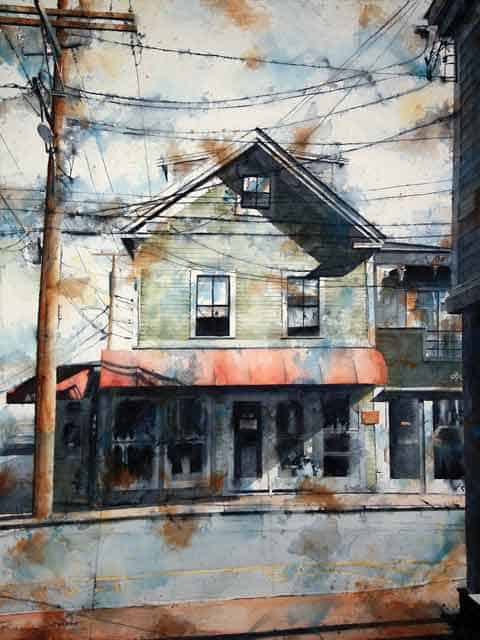
The lack of human beings in these images is also a striking feature. Certainly, it is rare to come upon a street in New York with no people on it, but even the Provincetown images, lacking in human, animal, or even plant life, are unlike anything else. But this is exactly what we see in these paintings, a glimpse of man-made structures without us, without anyone to identify with or direct our attention. These are structures that have their own kind of life to them. Asked why these specific buildings, Saternow laughs and says, “I don’t know. I walk around a lot and I have my camera with me, and I take a lot of research photographs. And you know, I’ll look at a city building a ton of times, and then, I’ll pass it at a different time of day and it’s completely different. And it’s either how the light is falling across the clapboards or the direction of the sunlight, or the shadows that are on top of the building. It surprises me.”
Saternow comes to painting from his earlier career in scenic design and art direction for theater and film. In that career, he says watercolor was often used in the visualization process, so it’s something he’s always worked with. He no longer works much in set design for theater, but is still an art director for film. Thinking about his favorite films he’s worked on, Saternow says it’s the small budget, independent ones that he loves. “I’ve worked on a number of low-budget films, and those are particularly wonderful because it’s a small film with a small crew and they’re wonderful to work on.”
Saternow is also an active teacher, doing watercolor workshops in New York City and around the country, including a couple this summer at Truro Center for the Arts at Castle Hill. He says he’s been coming to Provinctown since 1987. “When I graduated from grad school, my boyfriend took me to Provincetown for the first time, as a graduation present,” he recalls. “I just fell in love with it, and I’ve been back there pretty steadily ever since.” He shared a place with local pianist Paul Bisaccia for a while, back in what he calls “a different time.”
“We’d take the cottage for four months, and Paul would practice piano and I would paint all day!” he says. “It’s a special place.”
Tim Saternow: Façades is on view at Kobalt Gallery, 366 Commercial St., Provincetown, July 5 – 11, with an opening reception on Friday, July 5, 7 – 9 p.m. For information about the workshops Saternow will be teaching this summer in Truro, visit castlehill.org. For more information about the gallery show call 508.487.1132 or visit kobaltgallery.com.
.