by Rebecca M. Alvin
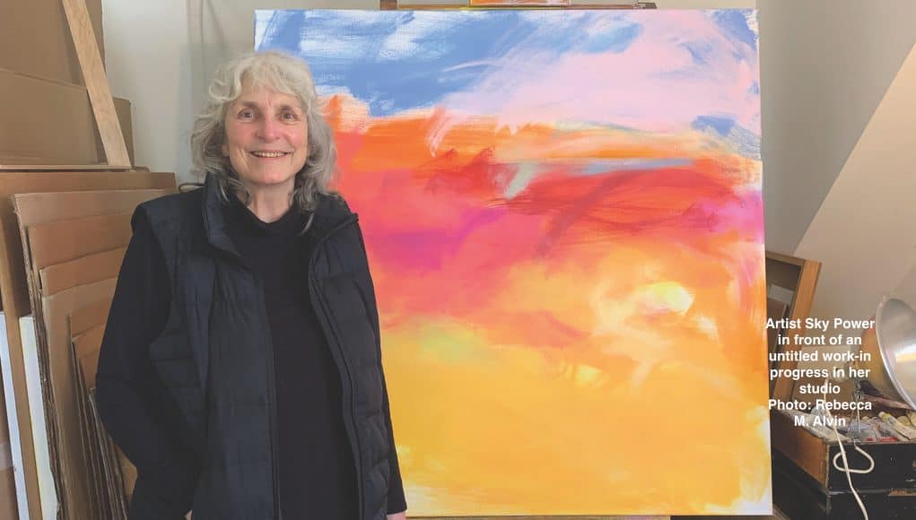
The titles for Sky Powers’ vibrantly colored abstract paintings come at the very end. But they are far from after-thoughts. “I think long and hard about what I’m going to title them. I want it to be significant,” explains Power in her Provincetown home.
While those with limited experience looking at abstract art sometimes try to “figure out” what they’re looking at by the supposed clues in the titles of the works, such a strategy misses the point because there is no need to lock down one specific meaning or reference point. It is a collaboration between form, line, and color created to elicit a response that has little to do with any representational reality.
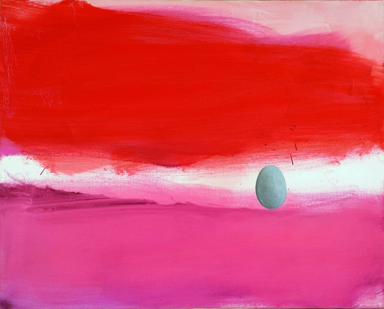
A painting hanging in her dining room, A Dream in a Dream demonstrates the inner landscape that influences what she paints. While the title does indicate the feeling she is trying to evoke, the feeling of being in a dream, it is not a literal representation of a dream she’s actually had. She uses it as an example to explain her process, which is one that both embraces essential principles of painting and allows instinctive choices to manifest.
“I start off with free abandon,” she explains. Using whatever batch of colors she mixes up that day and a two-and-a-half-inch brush, she brushes the oil paint onto the white canvas in bold, free strokes. Once she has a form she likes, she says she puts on a medium to make it dry a little faster and just leaves it “because I don’t want to have muddy colors and I want to keep the form. So, for example, this one I would have started off with this light pink back here. And then I would have come on top of it with this darker color.” She then uses rags with solvent to wipe away the pigment that she’s put on with a big brush. “Then I’ll have a residue you know, a thin pretty residue,” she explains. “Ultimately I put red on top and left the splatters because I like them. So what I ended up with was two forms that I loved together. Oh my god, I loved those! What next? Well, I don’t know what next, probably for months even sometimes. And then one day I’m looking at it and I envisioned putting an egg shape right in there. So I painted that in there. And that brought it all together. So what I’ll do on the paintings is I’ll just hold onto them until they’re finished. And to me, a finished work is strong. I don’t want to put work out that isn’t what I considered the best I could do with it.”
Power’s work will be on view in an exhibition spanning 50 years of her career at Provincetown Art Association and Museum (PAAM) May 5 – June 25. In addition, she will have a show at Berta Walker Gallery in June that features just her current body of work.
“I sent [Christine McCarthy at PAAM] images from all the bodies of work I’d been doing all these years,” Power explains. She didn’t have any work from the ‘80s and there was a piece from the ‘90s that she was unable to locate, but ultimately, McCarthy chose 25 images including a piece going all the way back to 1972. And while all of the 25 works chosen are clearly Sky Power paintings, they reveal different preoccupations at different times: the time she was working with charcoal before realizing the difficulties of maintaining it; the complete absence of representational elements contrasted with other bodies of work where strong geometric forms are present and still others where more literal elements from reality coexist with abstract forms.
“She sent back those images and I thought, ‘oh my god,’ you know, I could see the connections over all of the decades. This isn’t a retrospective. It’s just that these are the ones she liked, and she liked the relationships of them and she happened to like the one in 1972,” Power says, explaining how it came to go back so far into her past.
That earliest piece, Waking Up was made when Power was in her twenties. “The interesting thing is that I can see the palette in ’72 in very much of my work still. I can see a lot of my iconography, you know there’s my markings in my work still. So, what I’m doing now and all through these decades is connected to it. And it’s the colors,” she marvels.
Power studied with Paul Resika, Selina Trieff, and Robert Henry. She studied art at the Cornish School of Allied Arts in Seattle, Washington, and went to Massachusetts College of Art in Boston (albeit for two weeks before realizing her studies would interfere with her actual painting). And she’s taught locally, so there’s no question she values training, but if you look at Power’s work, it doesn’t look like anyone else’s and it doesn’t directly follow in anyone’s footsteps, even as she emphasizes the importance of Resika’s influence as a colorist. The work is a deeply personal amalgam of all that she is and all that she’s experienced in her life, a unique portrait of the artist herself, you might say. It’s the way she sees the world.
Her Texas twang reveals her upbringing in tornado alley. She spent part of her childhood in Texas, part in Wyoming, but has been in Provincetown for over 45 years. Still, she says, her childhood experiences with nature are still vivid in her memory.
“I’m completely affected by my environment, wherever I am,” she says. Although the political climate in Texas has kept her from returning for a visit, she carries with her those childhood experiences, particularly of the wild Texas weather.
“I lived in tornado country, so I remember being a little girl, you know, out there, playing around outside, and then becoming aware that it was so quiet out. I lived in a little town, like the size of Provincetown, so it wasn’t like there was noise. But it was quiet in a nature way that got my attention,” she recalls. “And I don’t know if they’re the negative ions or whatever’s going on before a tornado comes in, but you can feel it in the air. And I could hear a hawk, flying above me through the air, too. And there was a yellow tinge to everything. I thought, ‘What is this?’ Well, you know, within a half hour we had some pretty big storming coming in and it was a tornado.”
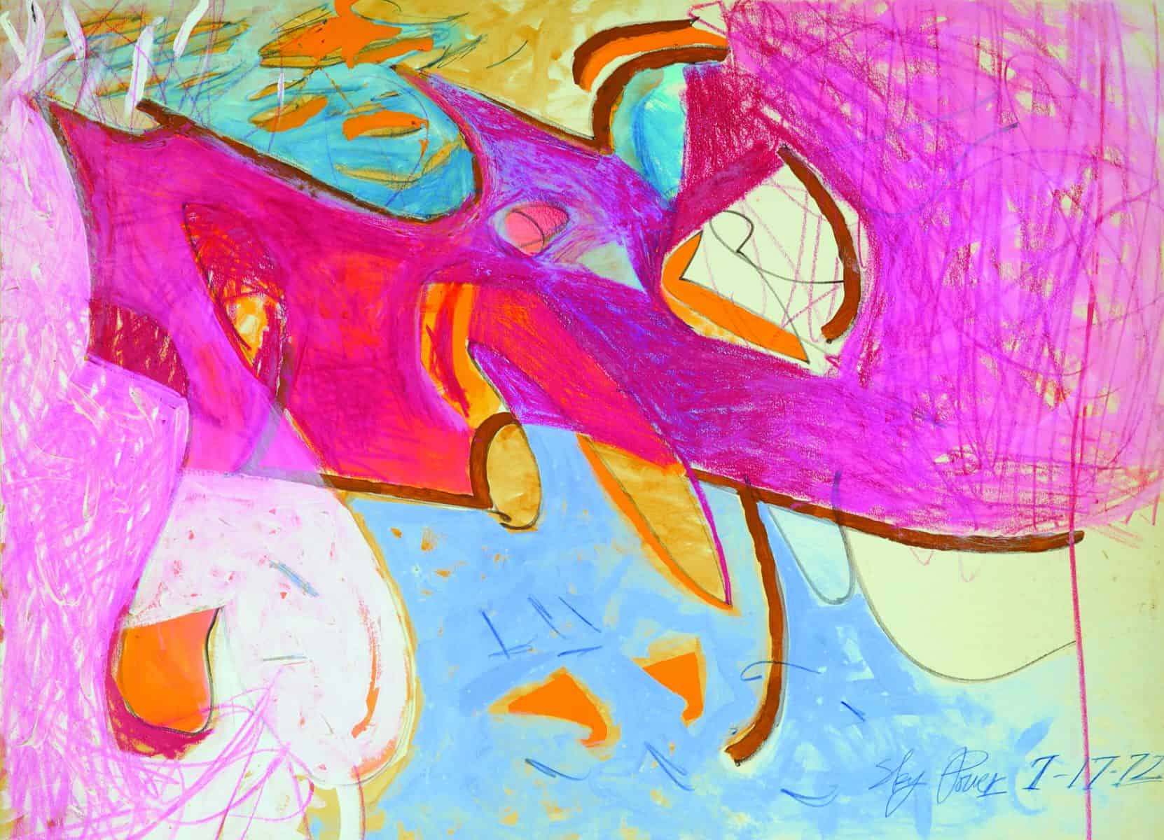
You can see the evidence of this multisensory experience in Power’s more ethereal abstract works, and you can also see her childhood fascination with drawing reproductions of paintings by the Old Masters, which she learned in school, in the more concrete forms that sometimes show up in her otherwise completely abstract works recently, giving them a slight narrative element.
That sense of overpowering weather is something New Englanders can certainly relate to, albeit more connected to the ocean than to the sky. In New England we are coastal, whereas northern Texas and Wyoming have no ocean, but Power says there is a similarity in the landscape that may not be as obvious to us.
“In Texas it was very flat where I grew up. So, there was a horizon, and it felt like infinity beyond,” she explains. “And here, it’s the same thing. You have the land, but then it’s the ocean. So the horizon is on the ocean, but it feels like to me, when I’m looking at the horizon here on the ocean, it looks like it’s for infinity, forever. And that’s how it was in Texas where I grew up, the same thing.”
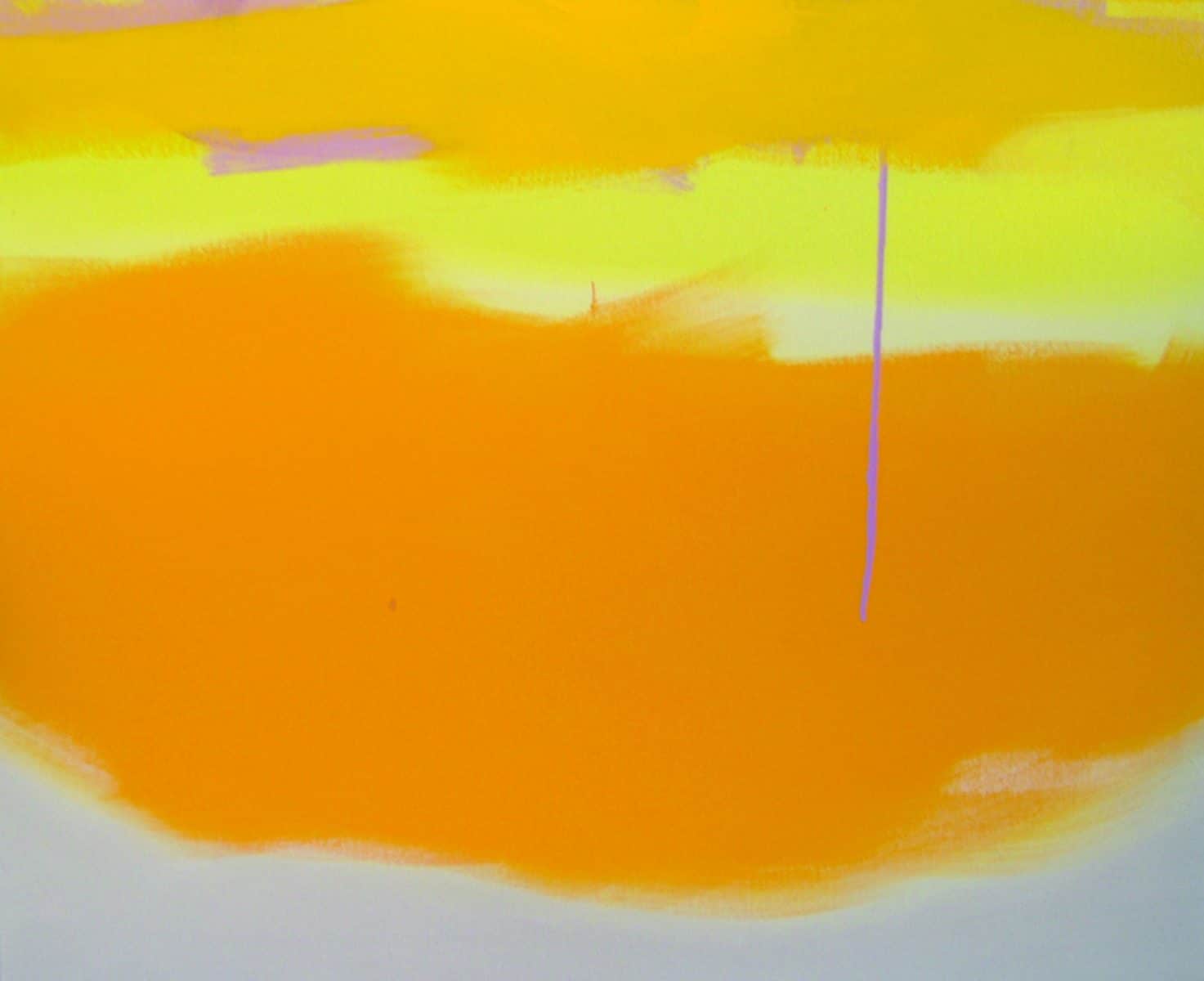
Power’s work often includes that horizon line, sometimes more literally visible than others. It’s a line that connects regions of the image. A good example is Anchored by the Sea, which demonstrates the expressive use of color and shape, but also Power’s way of seeing the relationship across the horizon, which creates a unique piece with a thought-provoking title.
“Most of my work has a horizon. So that can be land or sea below. It can be the sky above. I often have clouds and weather in it. But because of that purple drip coming down, I saw the clouds as being anchored by the sea, not beside it. In other words, I saw the sea as anchoring the clouds above as if it were like a boat,” she explains. “I’m not traditional very much, and so I was much more attuned to the concept of it…I drew an association with the sea and the sky because of the horizon in that line. It does not matter to me that they’re yellow tones, because I don’t necessarily associate the sea with blues and greens. Because there’s a lot of colors in there.”
Sky Power will be featured in Beckoning Color at PAAM, 460 Commercial St., Provincetown, May 5 – June 25, with an artist reception on Friday, May 19, 6 – 8 p.m. For more information call 508.487.1750 or visit paam.org. Her latest work will be exhibited at Berta Walker Gallery, 208 Bradford St., Provincetown, June 16 – July 9, with an opening reception Friday, June 16, 5 – 7 p.m. For more information about that show, call 508.487.6411 or visit bertawalkergallery.com.


